Overview
UT Go! is a Pokemon-Go style app that provides a fun and engaging way for students to discover new study spots around the UT campus.
UT Go! provides users with information about the study space and the resources available for use as well as navigation to a selected study location. Users can also add their own notes to a study spot’s profile once they’ve captured it.
This project followed a design thinking process that spanned over the course of a semester and concluded with a high-fidelity prototype of a mobile app in Figma. I worked on a team of four UX design students and was involved in all steps of the design process, which included user research, prototyping, presentation of findings and designs.
Project Outlook
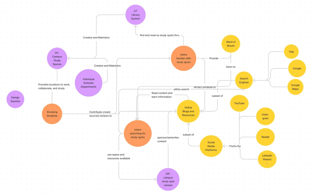
We started out by outlining the focus of our project: helping students find study spots that suited their needs. We also scoped out potential competitors, coming to the realization that existing resources lacked a centralized place where students could explore options for study spots from different locations around the campus as well as the resources (like computers, printers, etc.) available.
User Interviews and Analysis
We conducted a total of 8 interviews. From our research, we found that each student has varying preferences when it comes to study spots as well as other factors like noise level, resources, and aesthetics. We also found that students use social media to find recommendations for study spots from other students and use Google Maps to find their way to the desired location.
Quote 1:
“I don’t like places that are too
quiet, they give me pressure.”
Quote 2:
“I also like the scholars commons
since it’s really quiet.”
Our findings indicated that the UT campus is massive and can be tricky to navigate, especially for new students unfamiliar with the campus. What's more is that there are lots of great study locations around campus, but information regarding the location, hours of operation, and resources available are scattered across various websites making it difficult for students to efficiently find a study spot that suits their needs.
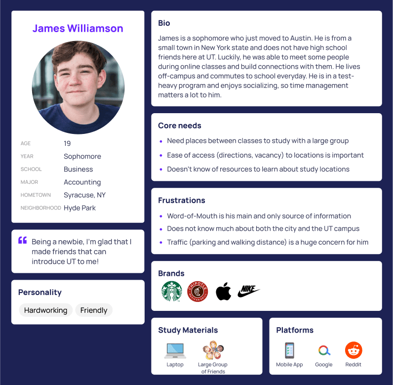
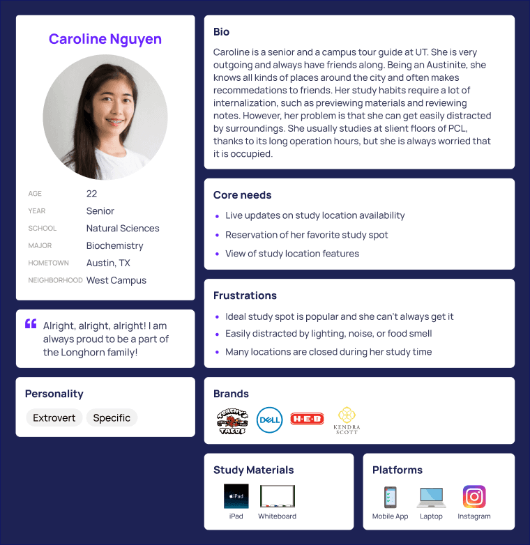
Essentially the design problem we were facing was that we needed a product/service that would allow students to find a study spot that catered to their preferences and provided navigation to the spot. We constructed an affinity diagram, a stakeholder map, and a couple personas to guide our decision making moving forwards.
Ideation
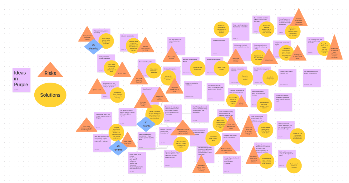
We each did an individual ideation exercise where we sketched out 20 ideas for solutions to the design problem. We then came together for group ideation where we considered possible problems to some of the ideas we had before we selected three of the strongest ideas to explore further.
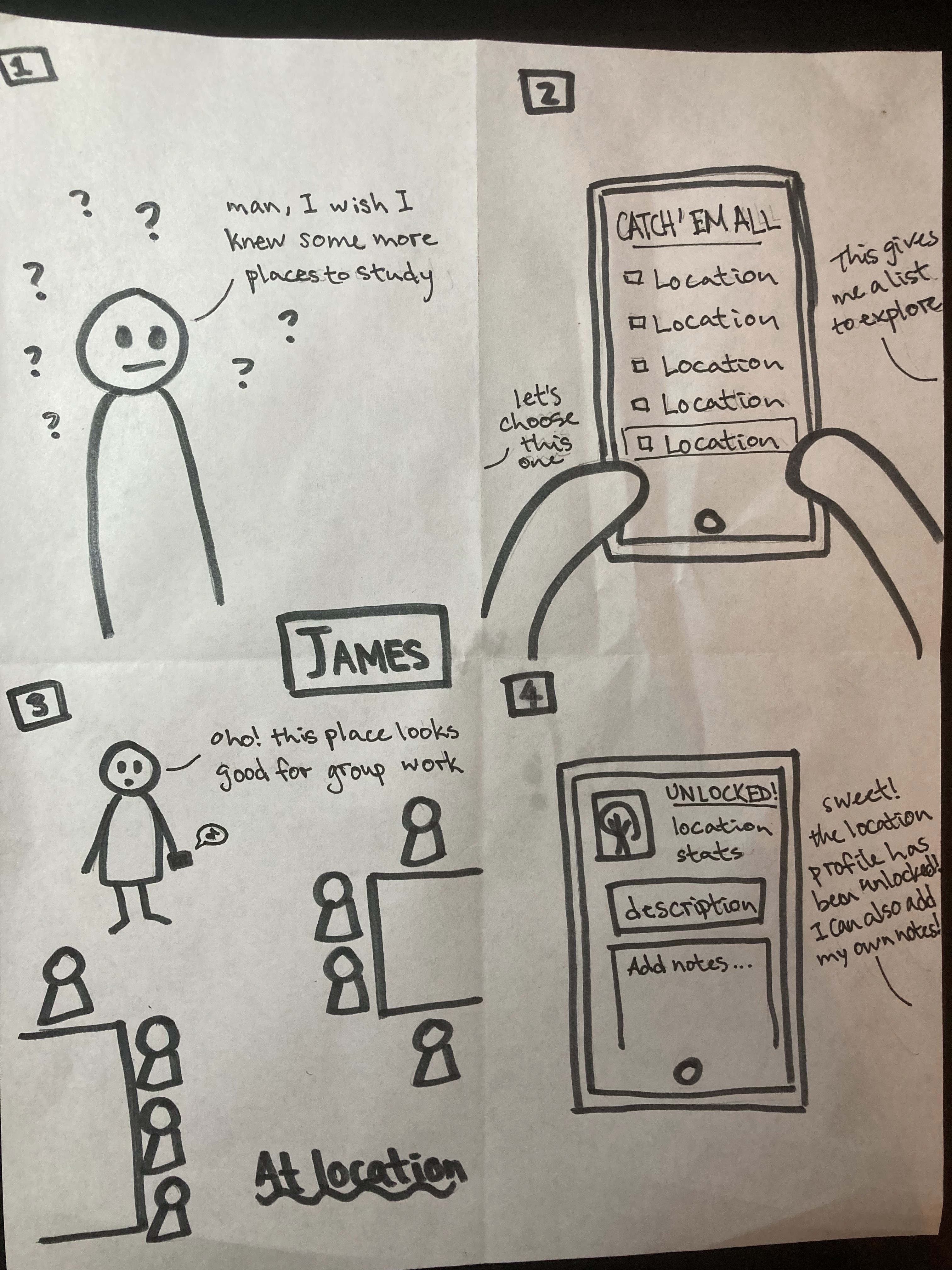
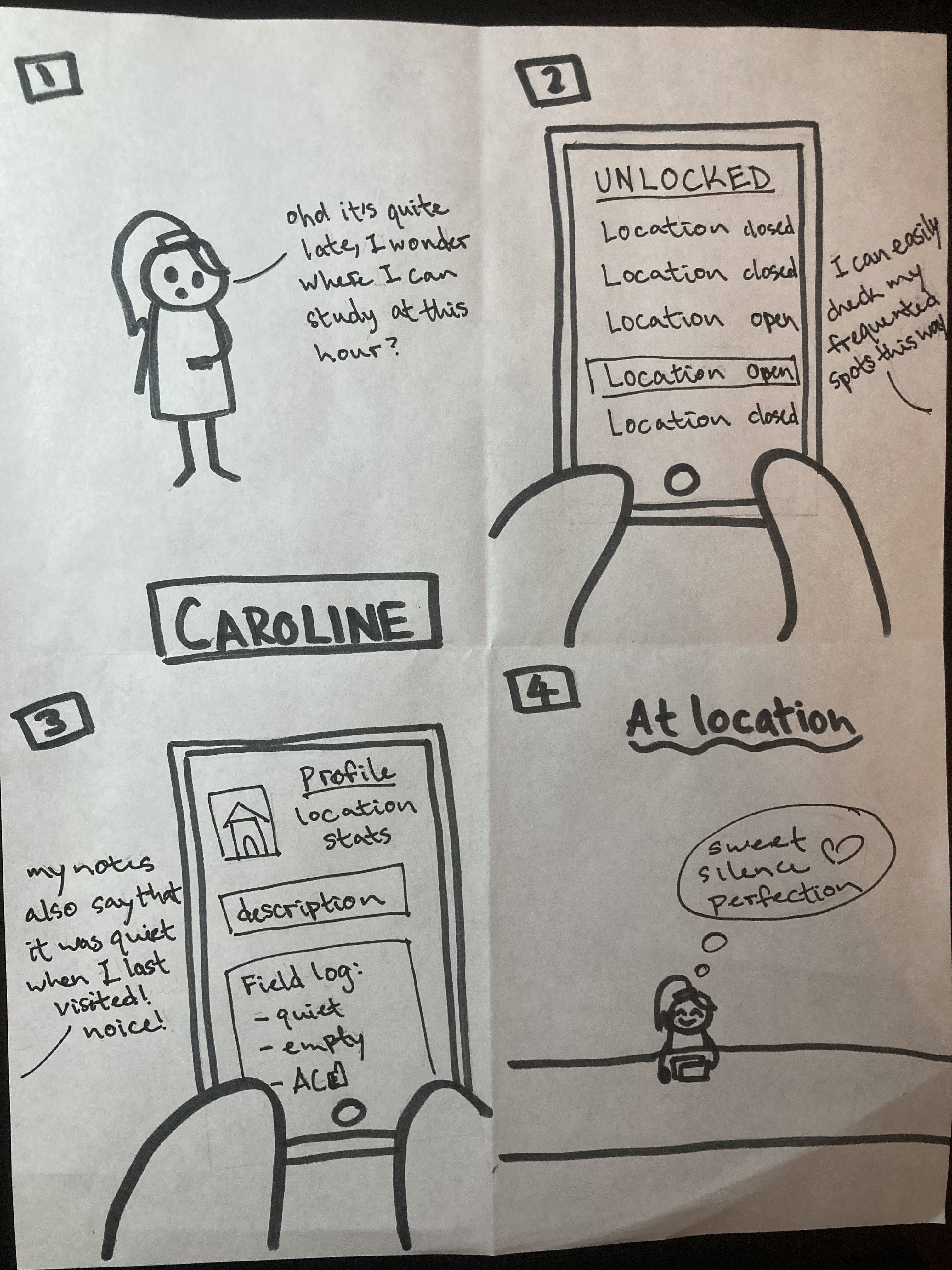
The following three ideas were then storyboarded:
Design a Pokemon Go style game where students compete in discovering new study locations
Have students be able to leave comments/feedback regarding a study spot rather than just viewing information
Design a leaderboard system where students can collectively pick their favorite study spots
I storyboarded the idea where students compete in discovering new study locations.
Paper Prototypes
After receiving feedback from our peers and instructors, we decided to move forward with the Pokémon-Go idea and integrate the other two ideas as features.
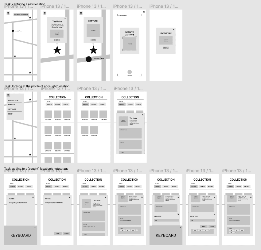
Each member of the team was in charge of designing for one feature of the app and coming up with three tasks that a user would be able complete with the feature. I was in charge of the feature that involved the ‘capturing’ of a new location and viewing its profile in the app’s index.
My tasks:
Capturing a new location
Looking at the profile of a “caught” location (see prototype to below)
Adding to a ‘caught’ location’s notes and tags
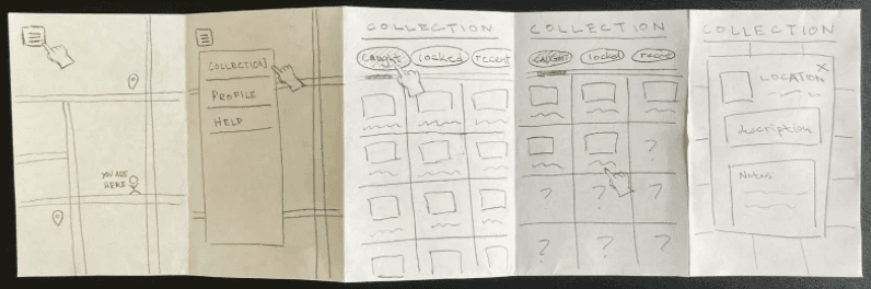
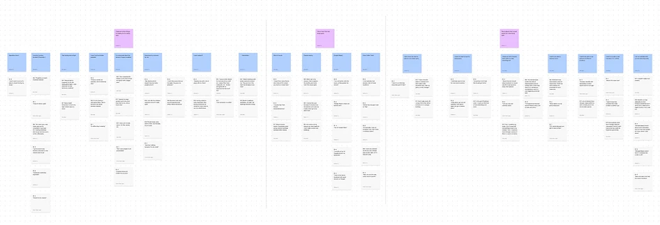
Low-Fidelity Prototypes and User Testing
We each created low-fidelity prototypes of our features in Figma and did 4 user tests where we gave the participants our tasks to try to complete. We then consolidated our findings and possible fixes to user pain points into an executive summary.
High-Fidelity Prototypes
We did a complete revamp of our prototype to establish consistent interfaces across the app. We also added a home button and back buttons in the prototype.
In addition to making the changes derived from the user testing findings, we also made the font and colors consistent throughout our prototype.
Our primary font was Roboto as it’s an Android system font that would be compatible with many devices and is a font that’s easy on the eye.
The color for the app was rather minimal and following the 60-30-10 rule:
60 - white for the base
30 - yellow for highlighting
10 - burnt orange for a Longhorn aesthetic
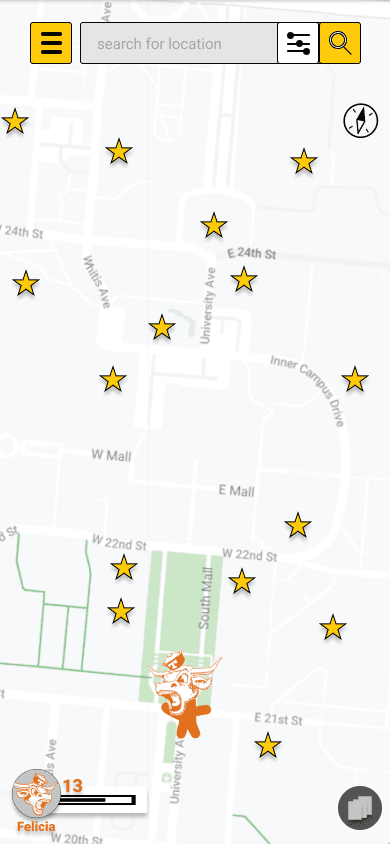
(Click the graphic to the left to explore our live prototype!)
Next Steps
Our next steps would be to run some accessibility tests on our prototype as well as additional usability tests to ensure all our flows are working as intended. Once the prototype is ready, we’d talk to the developers about the feasibility of the features and ready the app for production.
Let’s Chat!
I'd love to hear more about your experiences
as well as potential opportunities.