Overview
Slickdeals is a digital coupon website where users can find and share coupons as well as learn how to apply them to their favorite products and stores. This evaluation describes the conformance of the Slickdeals website with W3C’s Web Content Accessibility Guidelines (WCAG) 2.1 Level AA.
Evaluation of web accessibility was conducted using a combination of semi-automated evaluation tools and manual evaluation. The evaluation results are based on evaluation conducted on April 10th-14th, 2023. Please note that the website may have changed since that time.
Based on this evaluation, the Slickdeals website fails meet WCAG 2.1, Conformance Level AA.
Note: The full report with the accessibility checklist included in the appendices can be found here.
Scope of Review
Website
Three pages were selected to be reviewed:
Landing page: https://slickdeals.net/
Product page (Games - Hollow Knight): https://slickdeals.net/f/16568609-hollow-knight-voidheart-edition-xbox-one-series-x-s-digital-download-7-49?src=category_page
Coupon page (Amazon): https://coupons.slickdeals.net/amazon/
Review was conducted: April 10th-14th, 2023
Natural language of the website: English
Review Process
Website evaluated for conformance to WCAG 2.1 Level AA
Evaluation tools used:
WAVE Evaluation Tool, Version 3.2.3
Grayscale Tool, Version 2.0
Text Spacer Checker, version not specified (last updated 2021)
Manual review: employed in the evaluation of subjective criteria such as effective descriptions
Evaluation Summary
28 out of the 50 criterion were used for this evaluation
19 passed
8 failed
1 cannot tell
Criterion Failed:
1.1.1: Non-text Content, Level A
1.3.2: Meaningful Sequence, Level A
1.4.3: Contrast (Minimum), Level AA
1.4.12: Text Spacing, Level AA
2.1.1: Keyboard, Level A
2.4.7: Focus Visible, Level AA
2.5.1: Pointer Gestures, Level A
2.5.3: Label in Name, Level A
Slickdeals fails to meet conformance to WCAG 2.1 Level AA (and fails at Level A)
Evaluation Tool Outputs
Landing Page
(1.4.12) Text Spacing - Landing Page
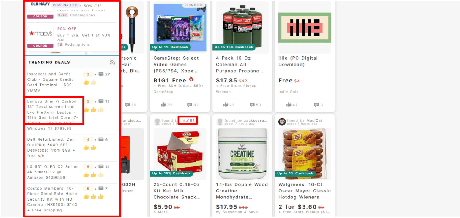
Sidebar feed jumps to cover left side of interface
Some text is partially cut off by the margins
Product Page
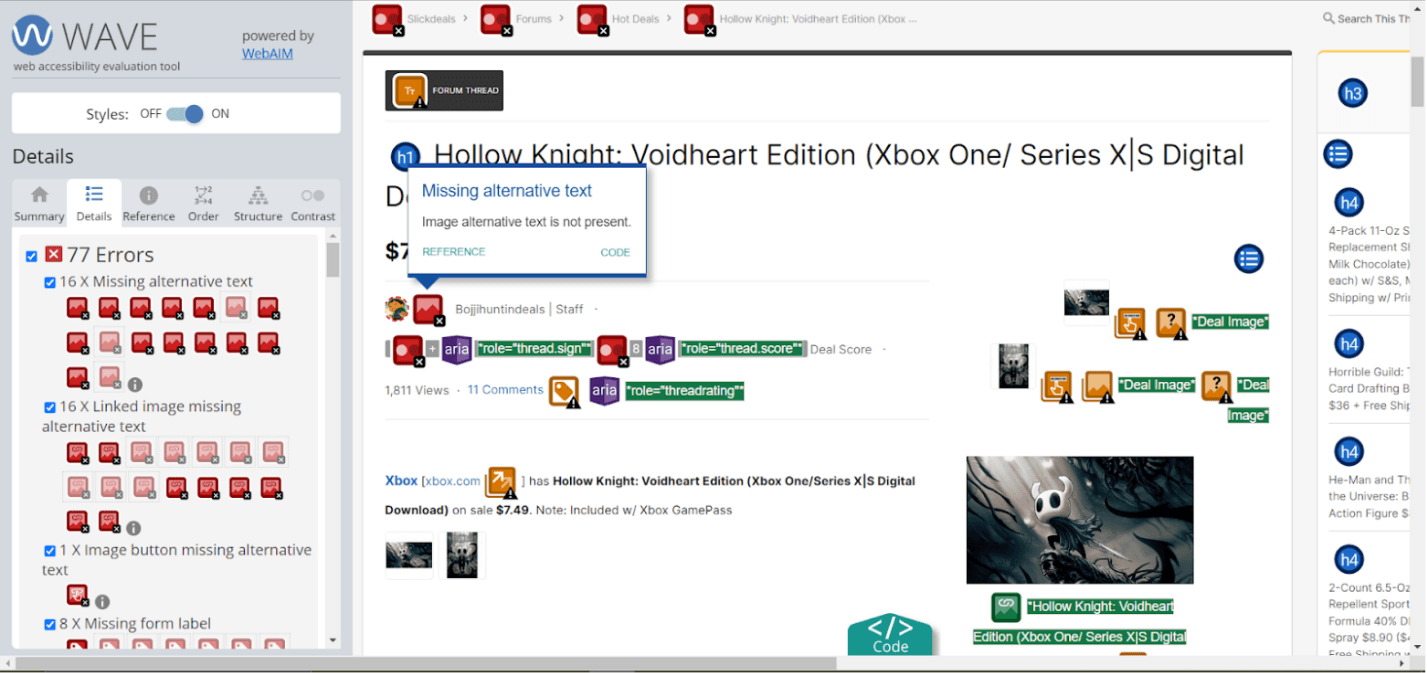
(1.1.1) No Alt-Text for Images
Most of the missing alt-text on the page are user profile photos or pictures of products uploaded by users
Coupon Page
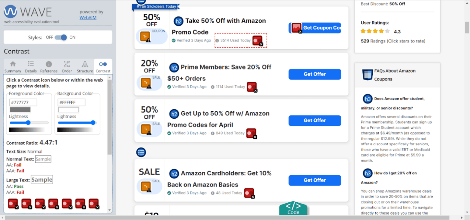
(1.4.3) Contrast
Light text on a light background, just barely missing the ratio for conformance
Recommendations
The following recommendations address the 8 criterion points Slickdeals failed to meet in the accessibility evaluation:
Most of the missing alt-text on the page are user profile photos or pictures of products uploaded by users
Encourage users to input their own alt-text for pictures they upload
Have default alt-text (ex. “profile picture for cheese1203”)
Criterion:
1.1.1: Non-text Content, Level A
Certain elements were left out of the navigation order or didn’t have visual indicators during ‘TAB’ navigation
Ensure all elements are includes in the navigation with consistent indicators
Criterion:
1.3.2: Meaningful Sequence, Level A
2.1.1: Keyboard, Level A
2.4.7: Focus Visible, Level AA
Menu bar requires horizontal scrolling and cannot be operated with single pointer
Reduce content on menu bar or consolidate elements into smaller dropdown menus so that horizontal scrolling isn’t needed
Criterion
2.5.1: Pointer Gestures, Level A
Like/comment icons don't have labels or hover text
Add labels under the icons or add hover text
Criterion
2.5.3: Label in Name, Level A
Low contrast between text and background color
Darken color of text to meet the conformance ratio
Criterion
1.4.3: Contrast (Minimum), Level AA
When spacing tool was applied to pages: the sidebar aligned to left and covered content (landing), some stats in boxes were cropped out (product), some text in filter overlapped (coupon)
Adjust spacing/padding settings of page to ensure the website is compatible with the use of spacing tools
Criterion
1.4.12: Text Spacing, Level AA
Sample Redesign
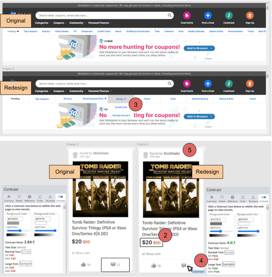
The landing page was selected for the redesign as it had the most diverse pool of failed criterion. The Figma file of this redesign can be found here.
The redesign focuses on two features of the page:
Menu bar
Some links consolidated into dropdowns so horizontal scroll isn’t necessary
Individual item/post
Added visual indicator to elements that are missing an indicator during ‘TAB’ navigation
Added hover text to elements without worded descriptions
Darkened text color to achieve a contrast ratio that meets the requirements
Let’s Chat!
I'd love to hear more about your experiences
as well as potential opportunities.